Number 5 | Day 8 of 365 days of stories

September 19, 2010

Cats of Bobobli, No. 5
Cats of Boboli, No. 5

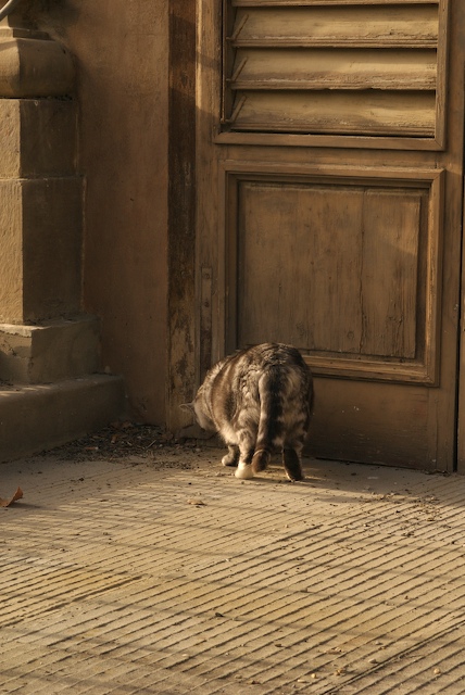
Cat Number 5, as I lovingly refer to him, is one of my favorite cats from Boboli Garden. Some might ask why, since he’s only showing me his behind, but it’s more about the feeling of the photograph than the actual subject (sorry Number 5).

This photo reminds me very much of Dutch paintings in the 1600s. Partly it’s Number 5’s position. He looks as if he has cornered something, and it brings to mind the metaphors of the paintings. The lighting also is a bit reminiscent of the Dutch paintings. While we don’t get into the full-blown black of the Dutch pieces, there’s definitely shadow and light playing together in the image, with the warm overtones from the fading sunshine and the dark wood.

So, of all the cats in the Cats of Boboli series, that’s why Number 5 is my favorite. Behind and all!
0

Back to Domestic Goddess, or maybe just Dreaming Domestic Couch Potato

September 9, 2009

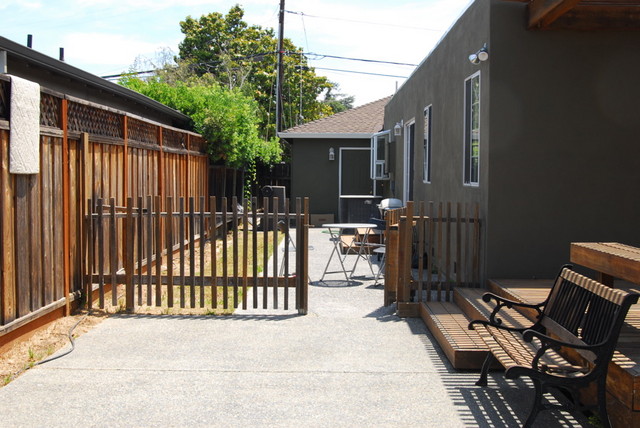
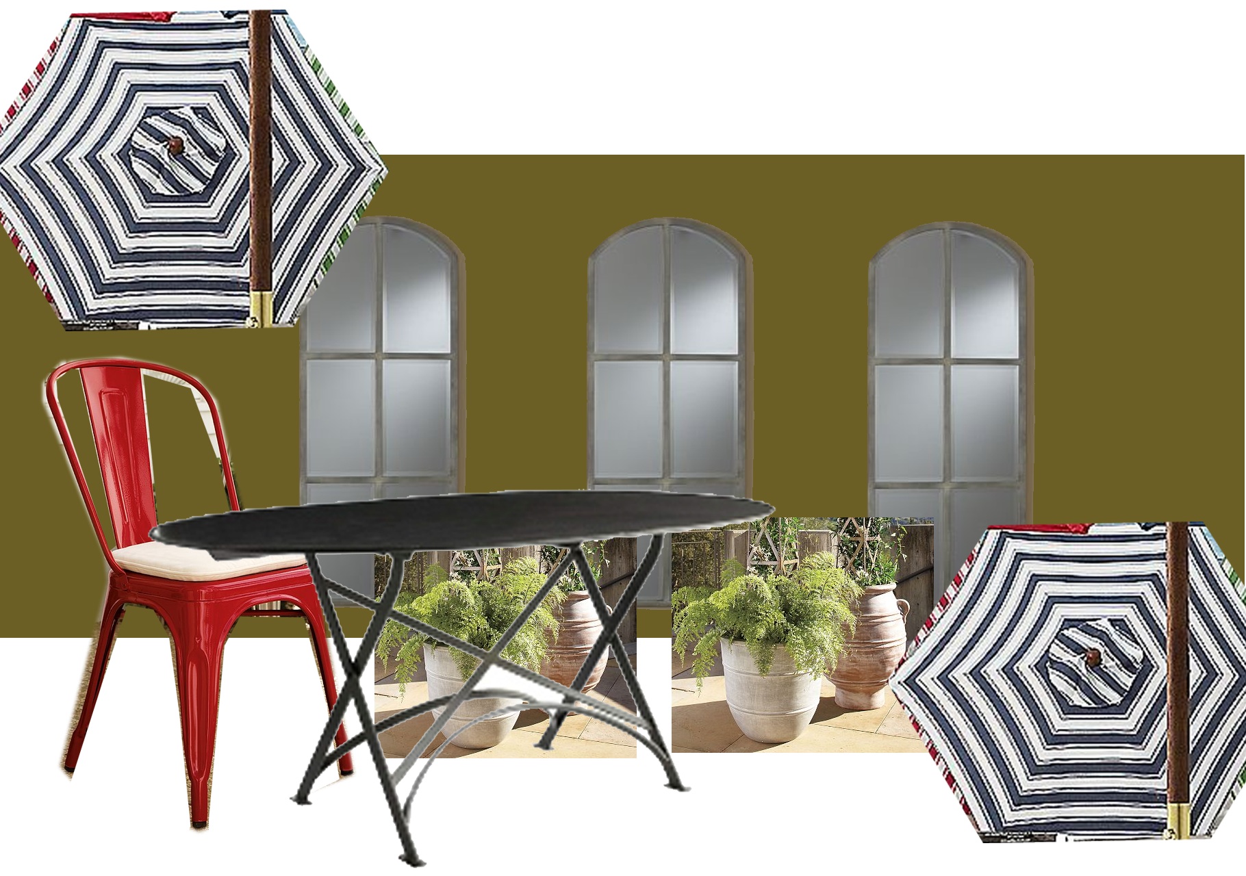
This picture posted on Flickr inspired me for the outdoor dining space. Of course, I don’t have enough room for all of those beautiful umbrellas, and Raju might kill me if I paint the side of the house (ala one of those HGTV shows we watched once upon a time, of course, she also cut away part of the deck; damn did her hubby need that margarita maker they won when he came home). So I’m paring down a bit and going with what seems to be leaning more toward a French feel with the red and blue and the Tolix chairs. Either way, it will be better than what it is today.


what it is today: clean slate or barren waste land? cup half full or half empty?

Of course, we’ll need more plants, and brighter colored planters than are in the mock above. Shortcuts – I just wanted some greenery in the picture.

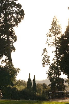
The current plan is to put in the tall, skinny evergreens, similar to the ones in this photo from Florence (center of the pic) in a row down the fence. That should give us some privacy and kill some of the ambient road noise. So I guess we’re bringing a little Italy back in. Maybe I can call this “Euroblend”?

0

Planning, Plotting, Prostitution

August 19, 2009


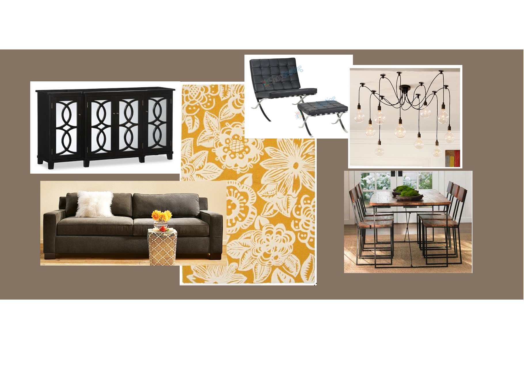
Family and Dining Room

“I wouldn’t call myself much of a planner. I’m more a fly-by-the-seat-of-my-pants gal, moment to moment, yeah, that’s me.”
– Vivian Ward, Pretty Woman

Even though that line is from a prostitute, it pretty much sums up my views on planning. I hate planning and like to live in the moment, but only when I want to live in the moment. Sometimes I just want to couch potato in the moment…

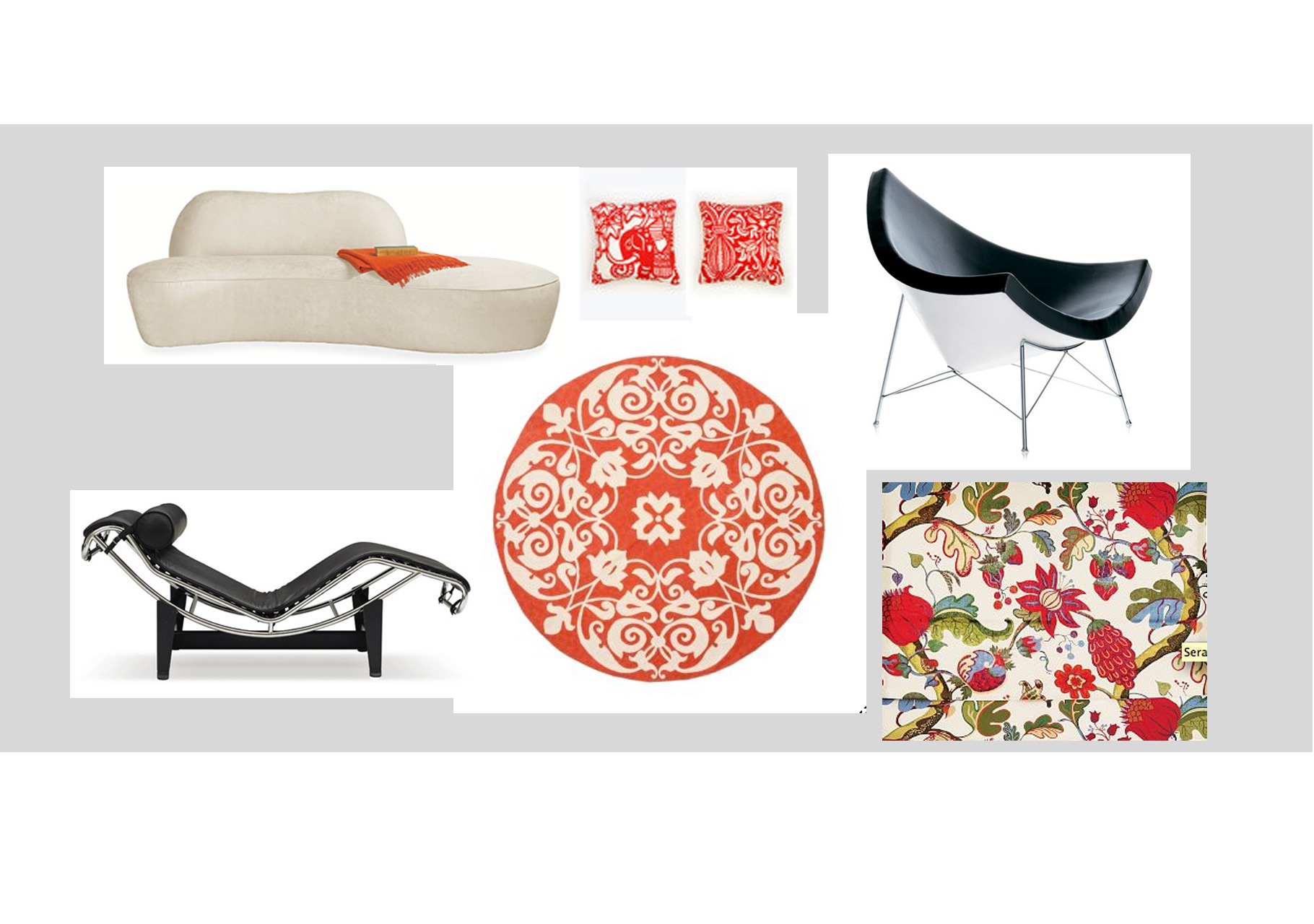
So this, this is odd, but a good exercise for me. Living with someone else, sharing a house, means I can’t just be me. Sure, I have all these ideas floating around in my head, and I know they’ll turn out. If they don’t, I can always change everything, right?


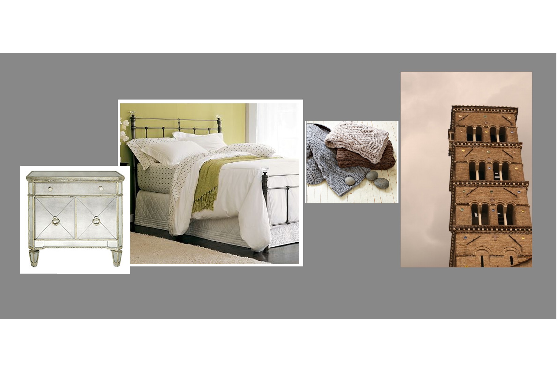
the Gray room – guest bedroom #1

Getting it all on paper before executing, with the occasional surprise thrown in, does seem to be working. The rooms, while coming along slowly, are coming along, and look just like my vision. Well, the little parts that are complete, anyways. I would say in the past things have only come out like my vision 50/50. So on the plus side, a greater rate of success, on the minus side, not so many happy accidents. I live for happy accidents. They’re what make me, well, happy.


Living Room

0

Yummy Inspirations

August 24, 2007

A while back, during the wedding planning mania, I stumbled across the work of a couple of artists that really piqued my interest. I never got around to posting it, so I will now. Both were posted on yumsugar, one of my favorite daily reads.

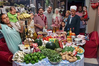
The first of the two is a book, Hungry Planet: What the World Eats by Peter Menzel and Faith D’Aluisio. The premise of the book is something fairly simple but pretty astounding when all binded together. The artists photographed families around the world with the food they consume in one week. The amount of money they spent on the bounty is also noted in the captions.

While I do find the pictures fascinating, I can’t help but wonder how they picked the families. Did they decide to pick the family in Chad to prove a point of the lack of food in Chad? Is there not a rich family in Chad that would have photographed much differently? And what about the U.S. families? They seem to be middle-income. Was there not a lower-income family that they could have photographed?

Of course, this is why I need to go buy the book. Maybe they chose the most representative of the country as a whole to feature (i.e. most of Chad has a $1.23 to spend on food, and most Californians spend $159.18 per week). Or, maybe they took artistic liberties and showed families that would prove whatever point they wanted to make. I will only know once I search out this book and read it.

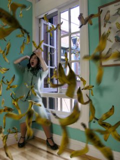
The other artist I discovered is like a mix of Cindy Sherman and Sandy Skoglund. Her name is Daniela Edburg, and she has some fantastical photos, mostly featuring food. In her series Drop Dead Gorgeous the subjects are consumed by the food, dying by an OD on MnMs, or being chased by a tornado of cotton candy.

It was refreshing to see this work. It’s been a while since I’ve looked at any art that has impressed me much — not sure if this is my fault or if there’s just been a lack of impressive art lately, but I’m glad this is changing for the better for me.

0

Remember

July 27, 2007

“When they tell you to grow up, they mean stop growing.”
– Tom Robbins

0